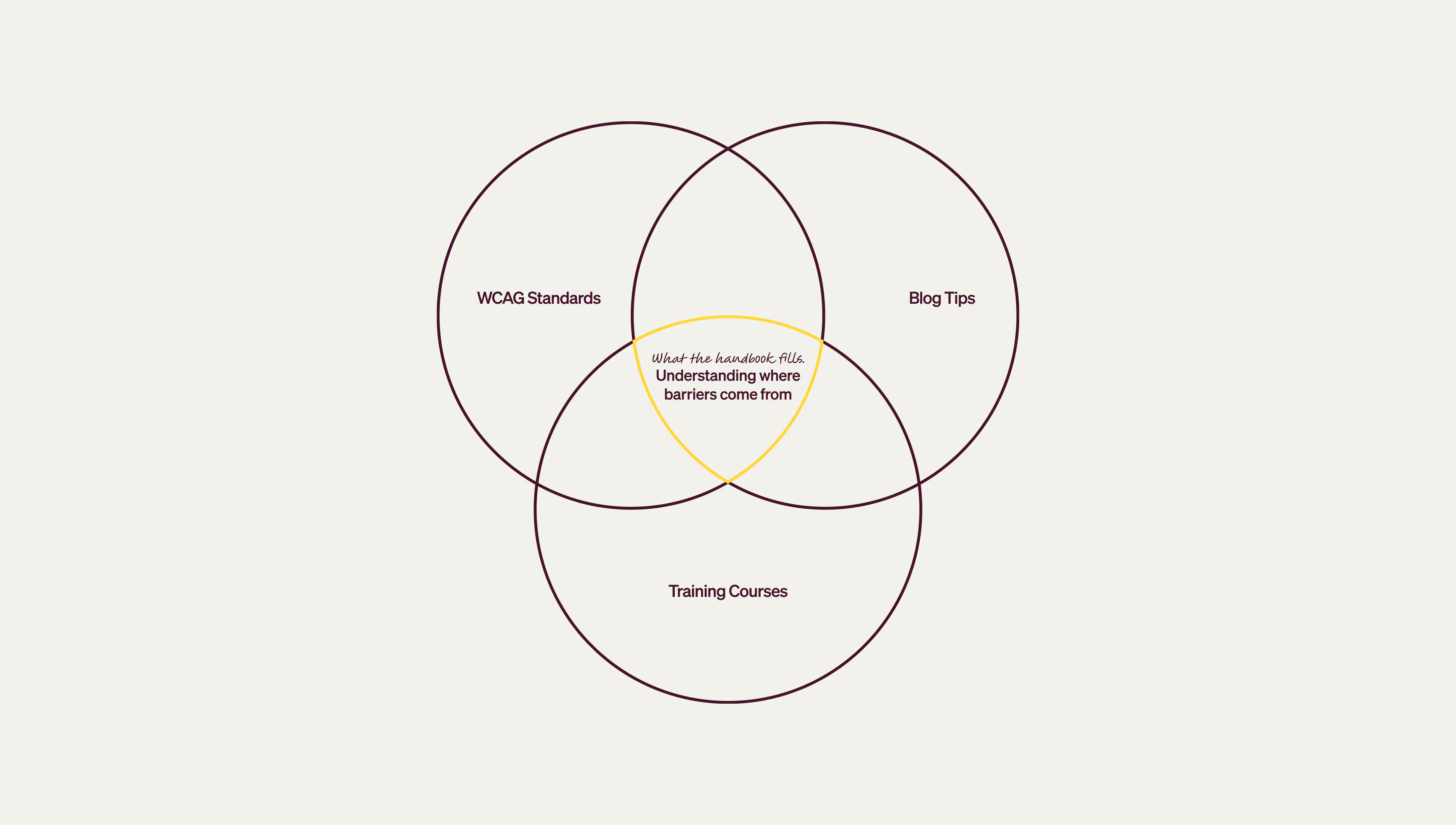
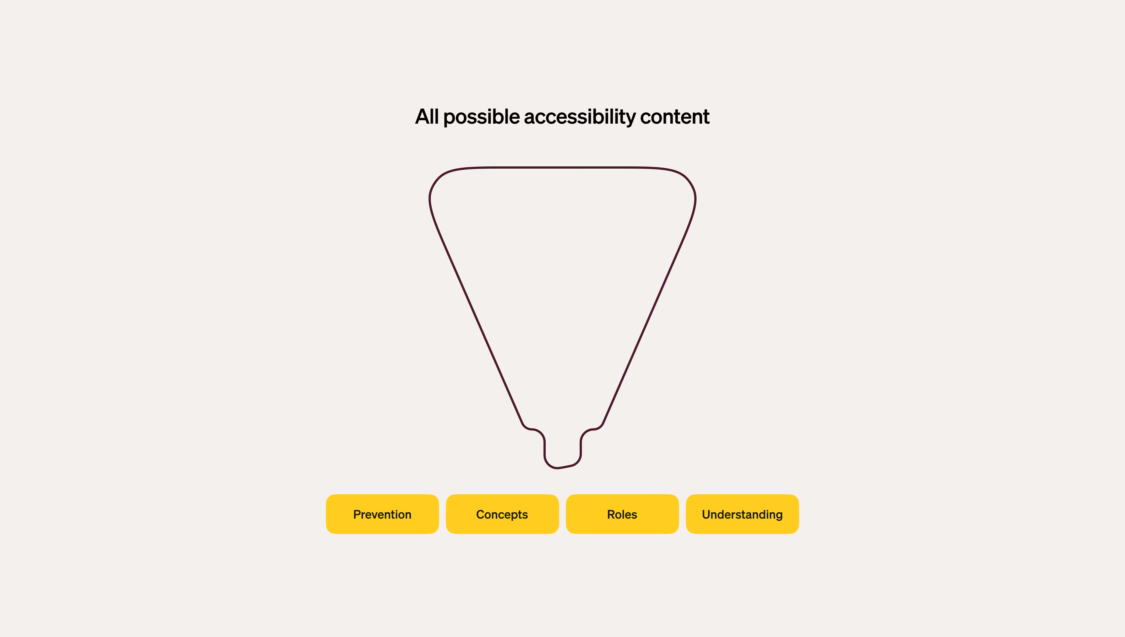
The structure needed to build understanding progressively. Abstract concepts first, then concrete application.
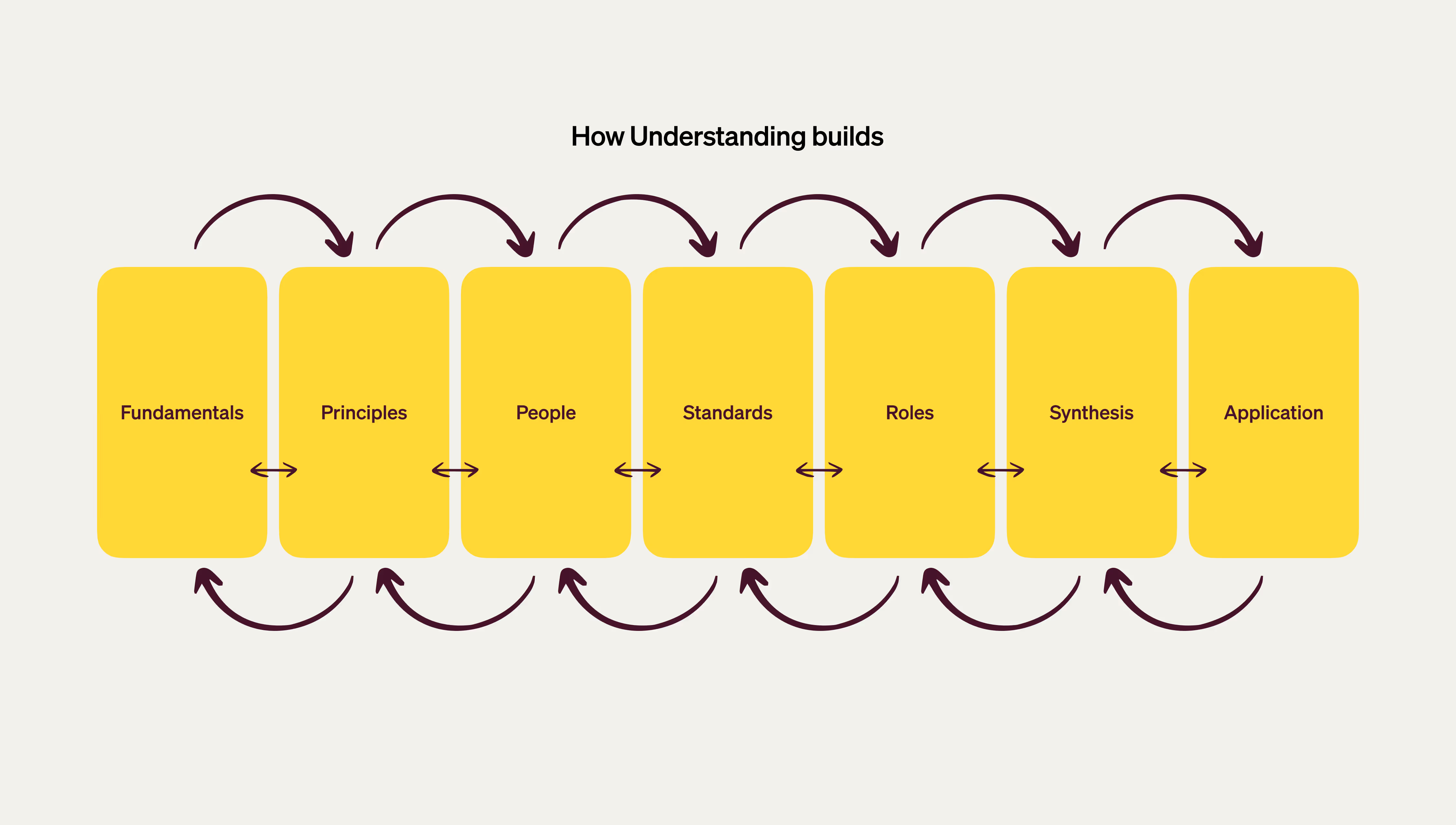
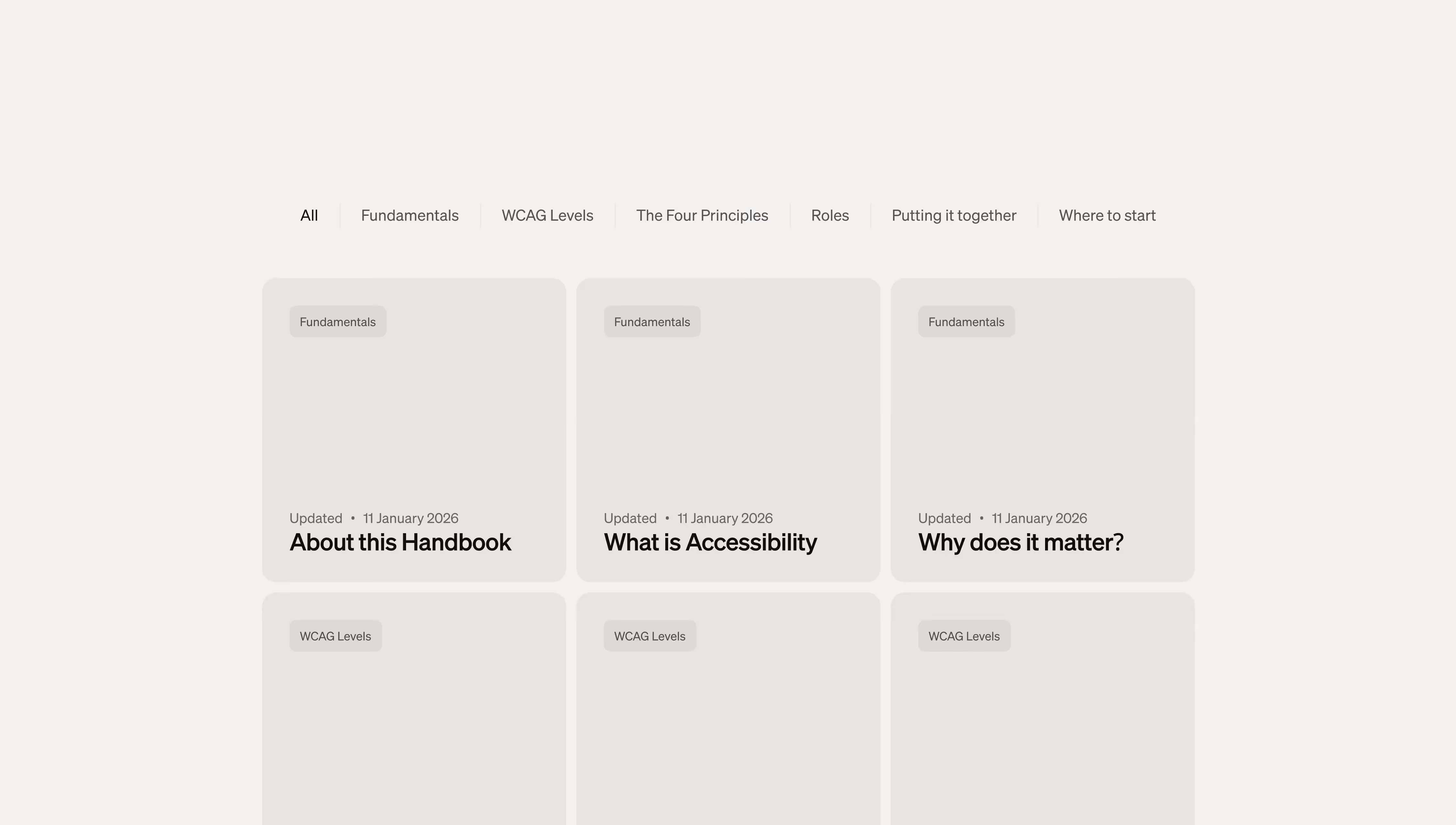
I settled on seven major sections, each serving a specific purpose:
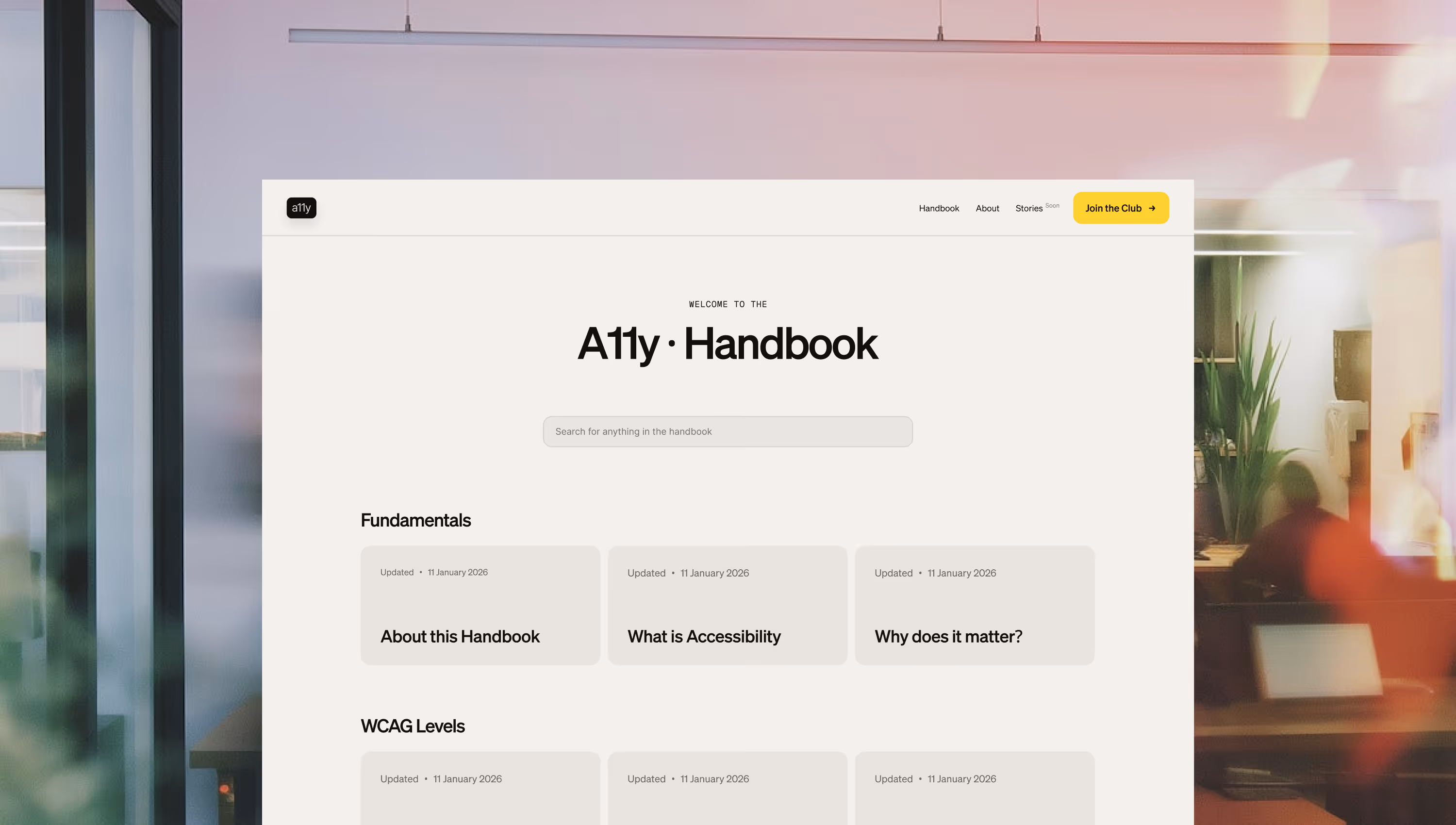
Fundamentals - What accessibility actually is. Not compliance. Not charity. Whether people can use what you build. This section establishes the frame: accessibility is about decisions, not disabilities.
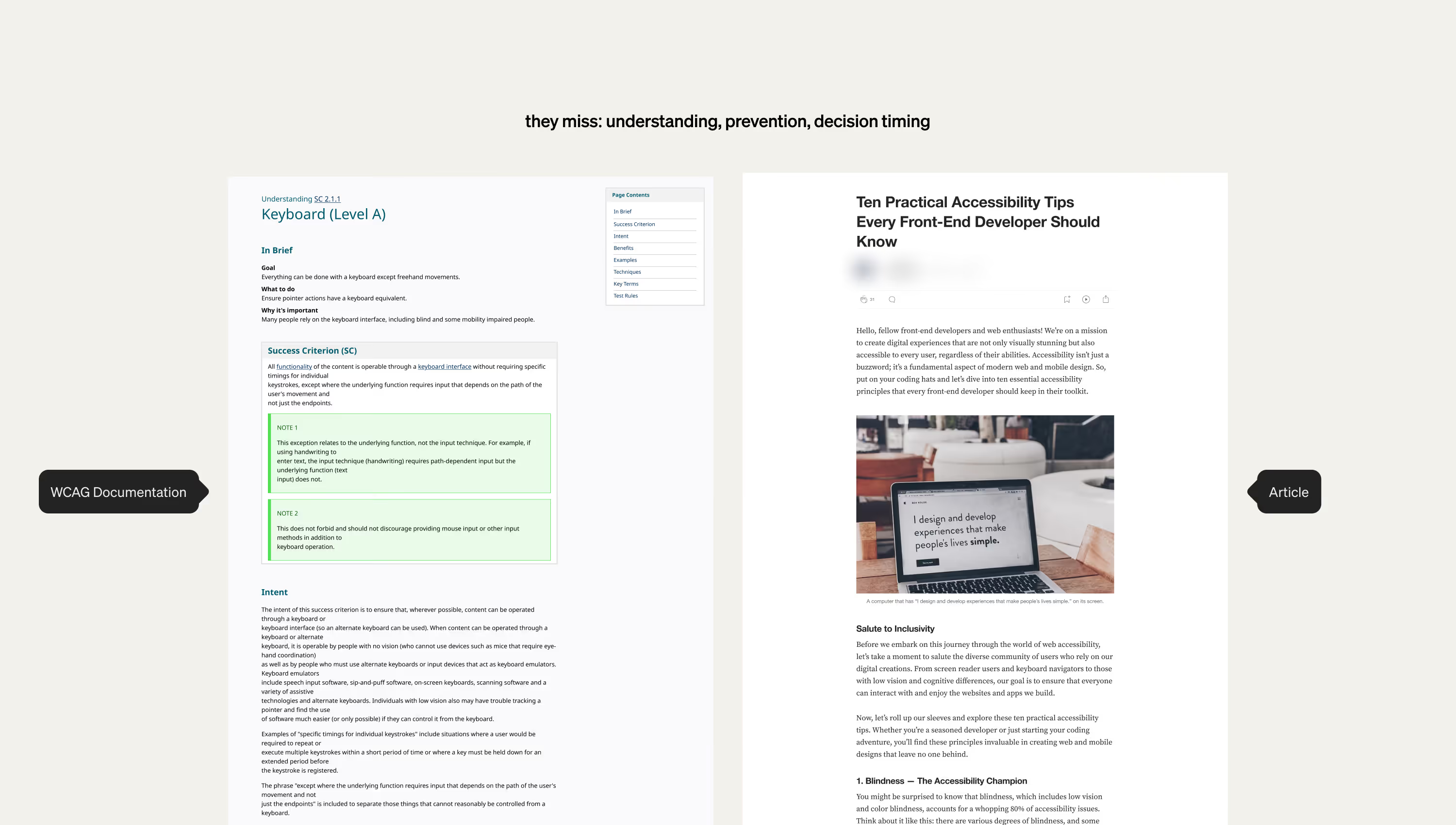
WCAG Levels - Level A, AA, AAA explained as severity thresholds, not achievement tiers. Understanding what each level addresses helps prioritize, but compliance is floor not ceiling.
The Four Principles - Perceivable, Operable, Understandable, Robust. These describe how products fail when barriers exist. Framework for recognizing problems.
People and Disabilities - Who experiences barriers and how. Visual, motor, cognitive, auditory impairments. Temporary and situational barriers. Understanding impact changes priorities.
Roles - Where barriers originate. Content creates structure. Design creates patterns. Development implements both. This section maps decisions to roles and shows timing.
Putting It Together - How everything connects. Where barriers actually come from. Common objections and reframes. Synthesis of the framework.
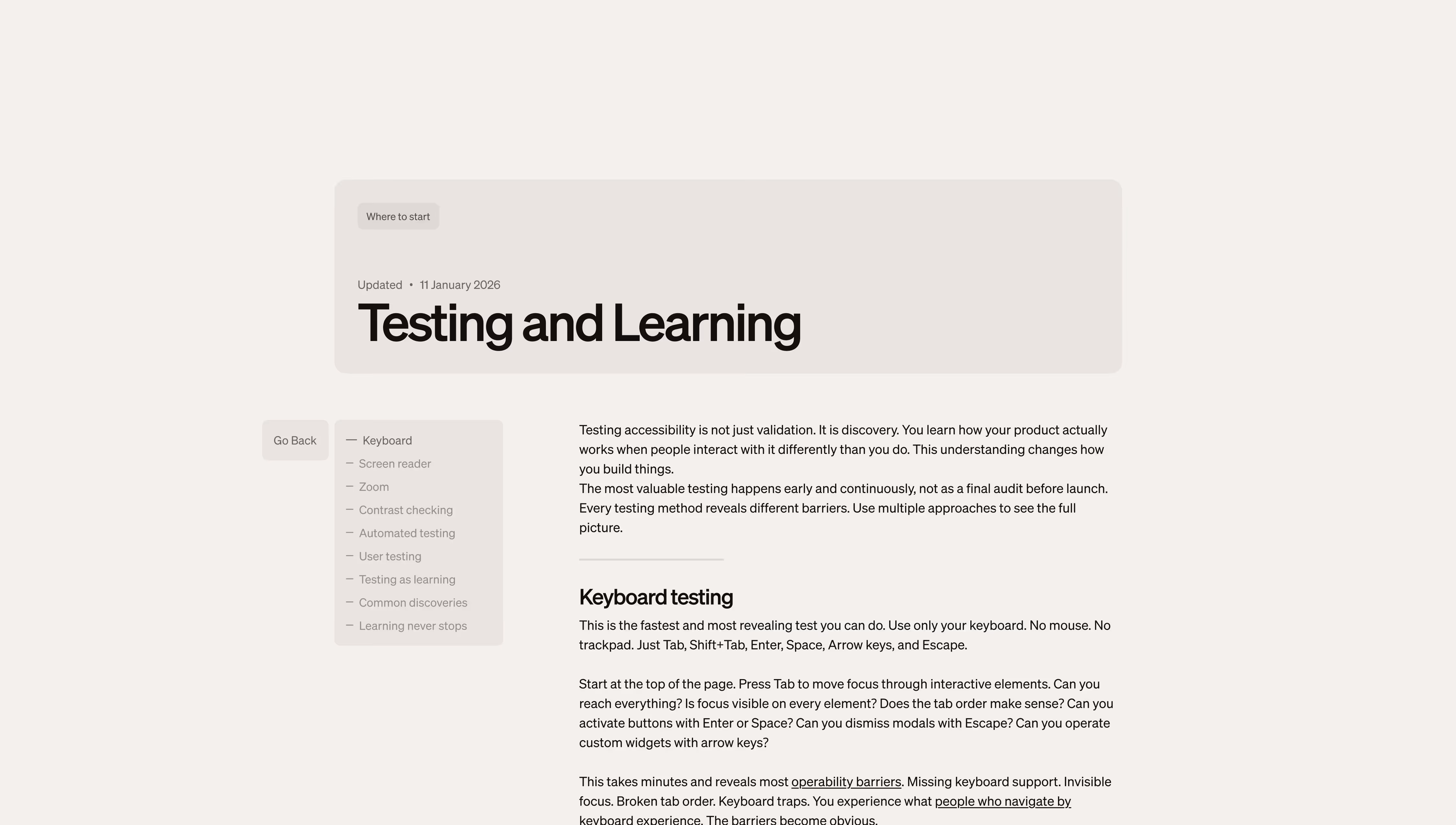
Where to Start - Application. Different starting points. What to prioritize. Testing methods. How to build it into practice.
Each section builds on previous understanding. You cannot apply standards without understanding barriers. You cannot prevent barriers without knowing where they come from.