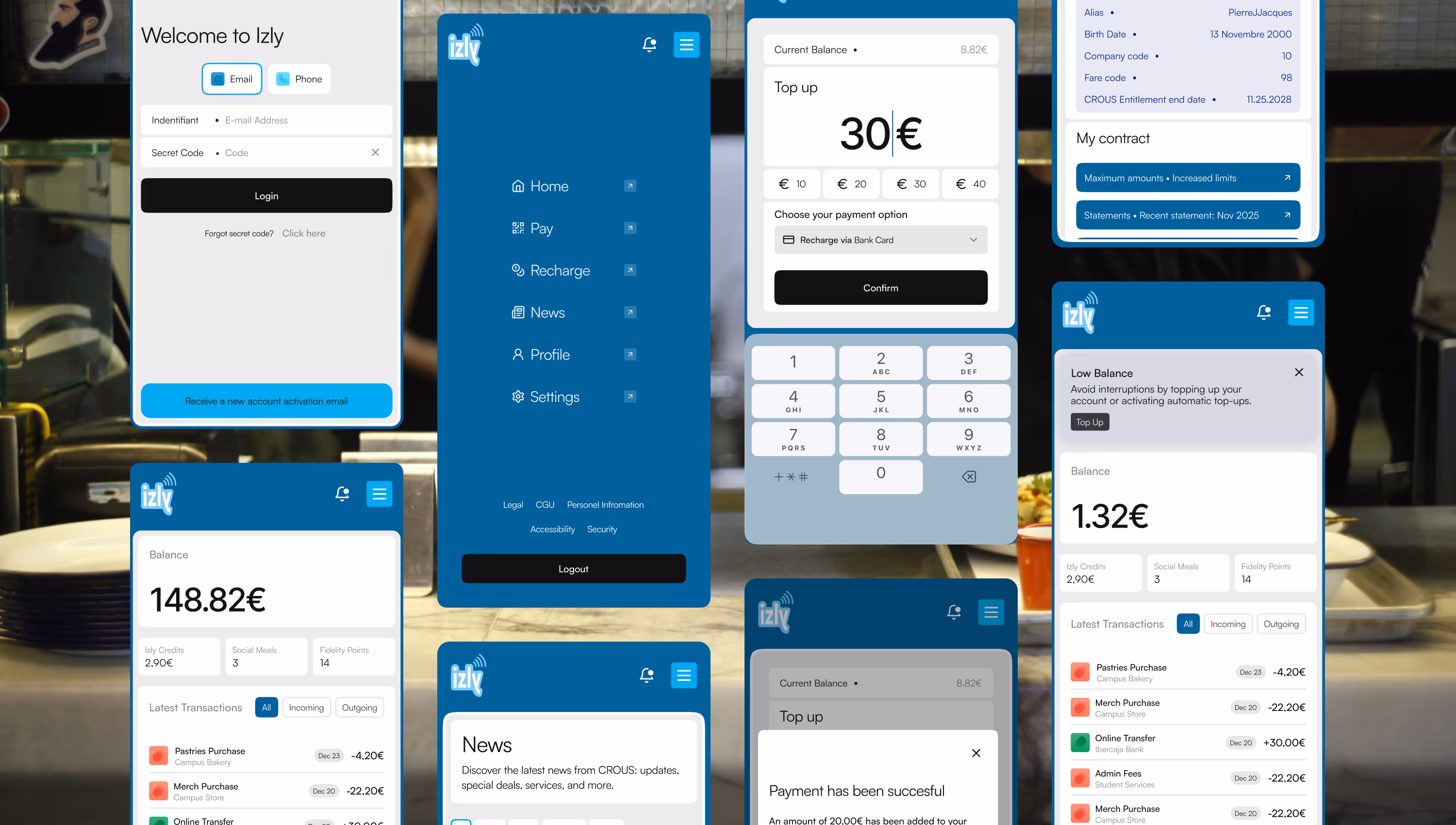
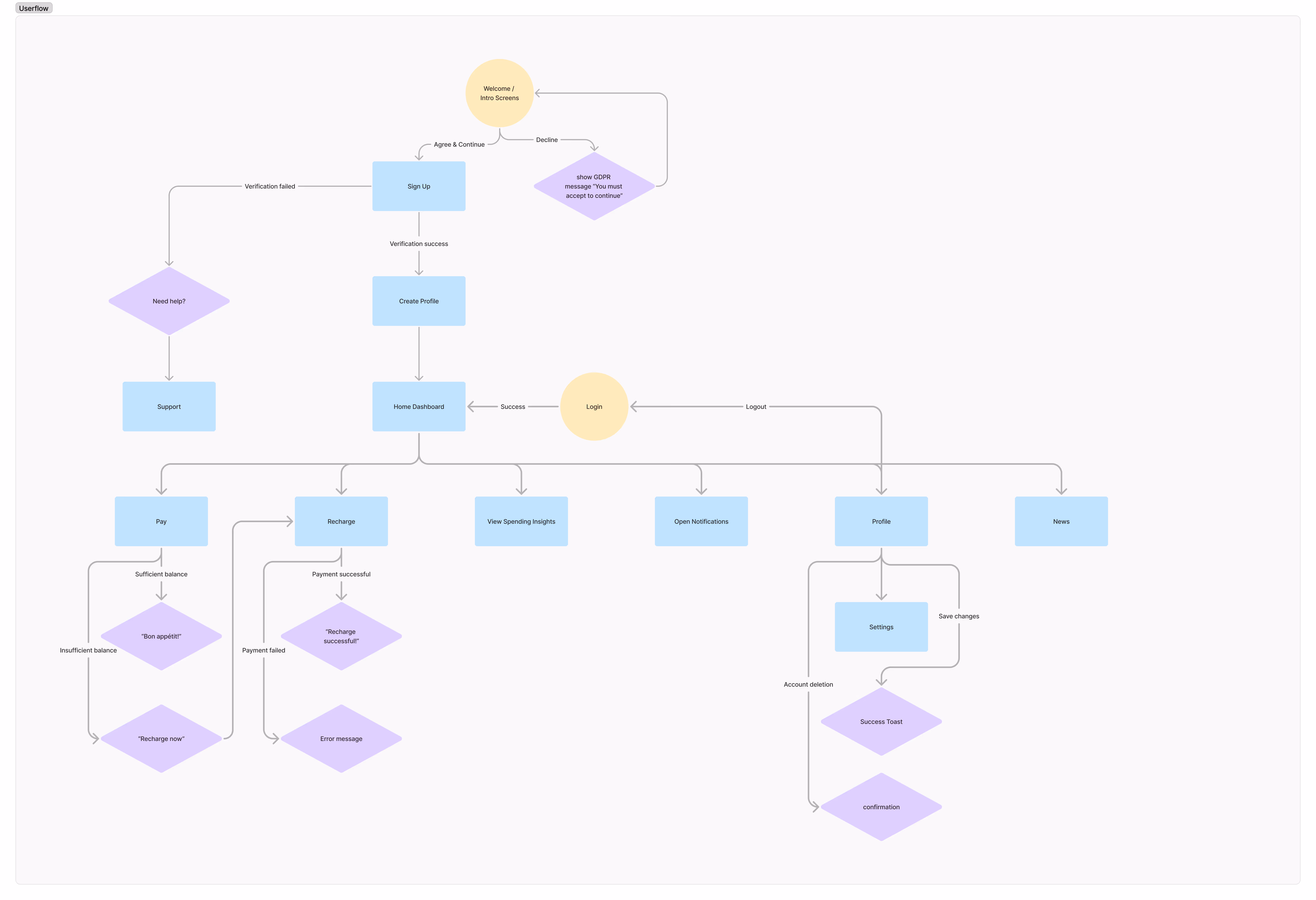
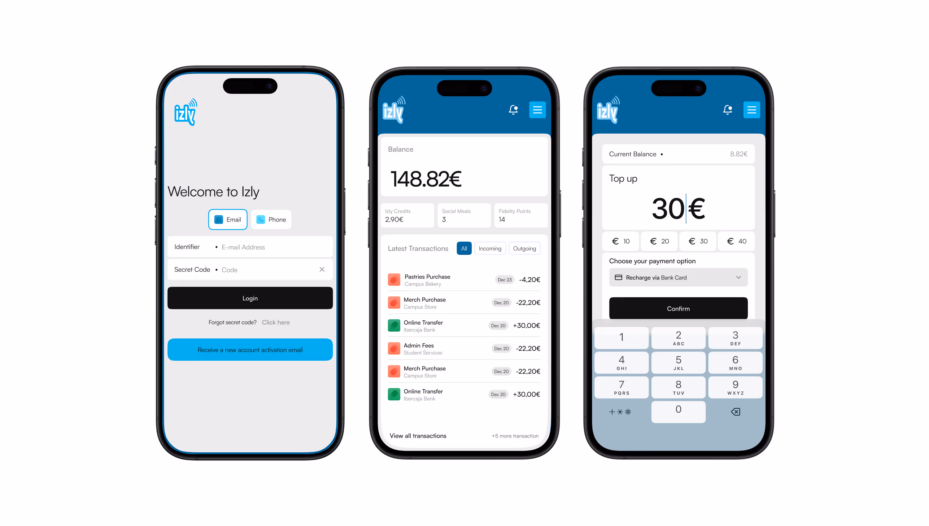
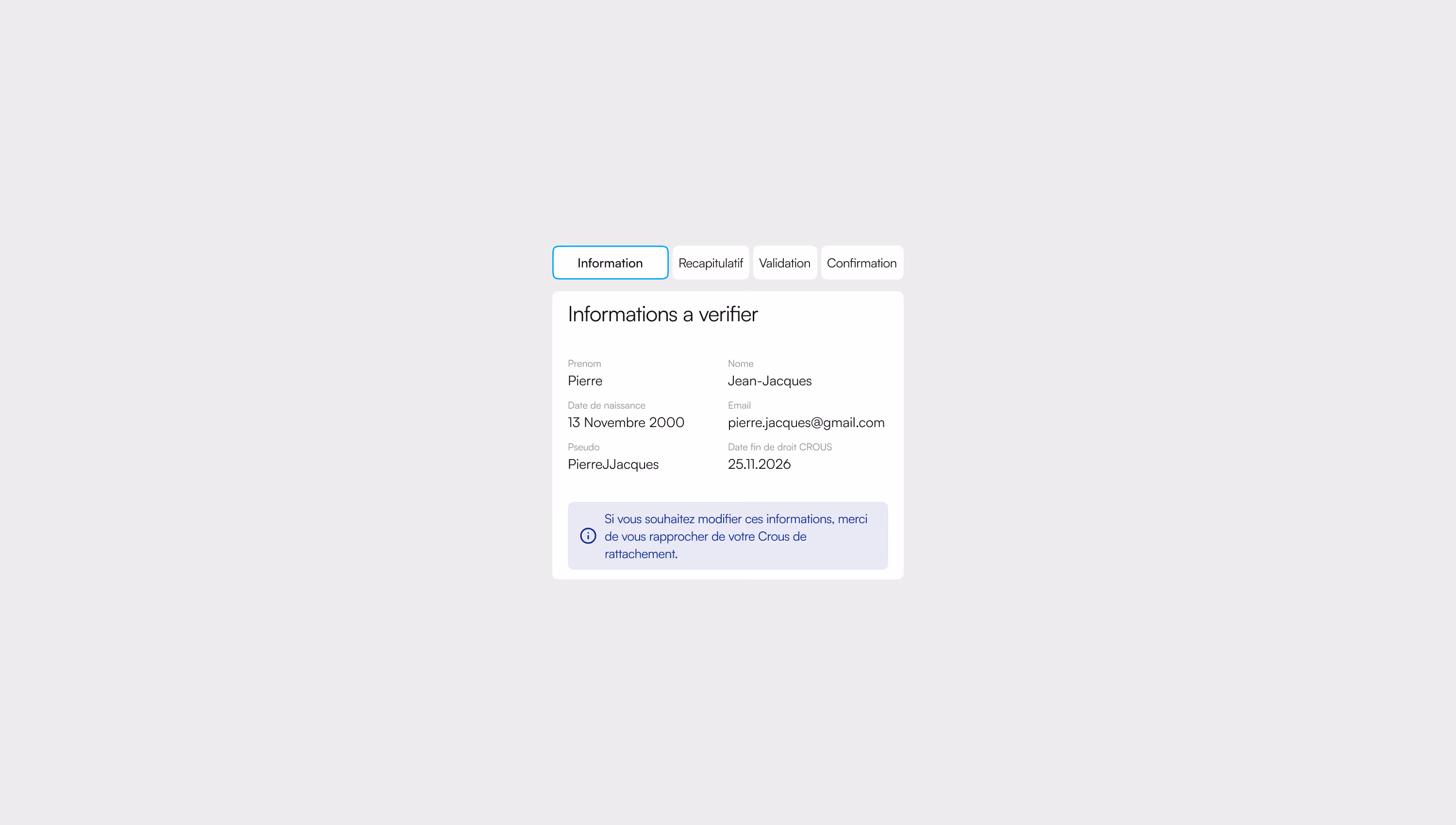
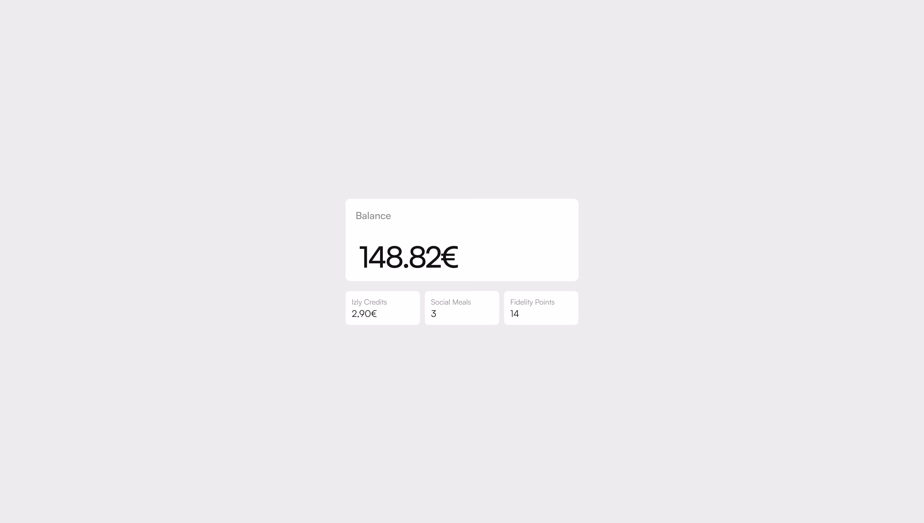
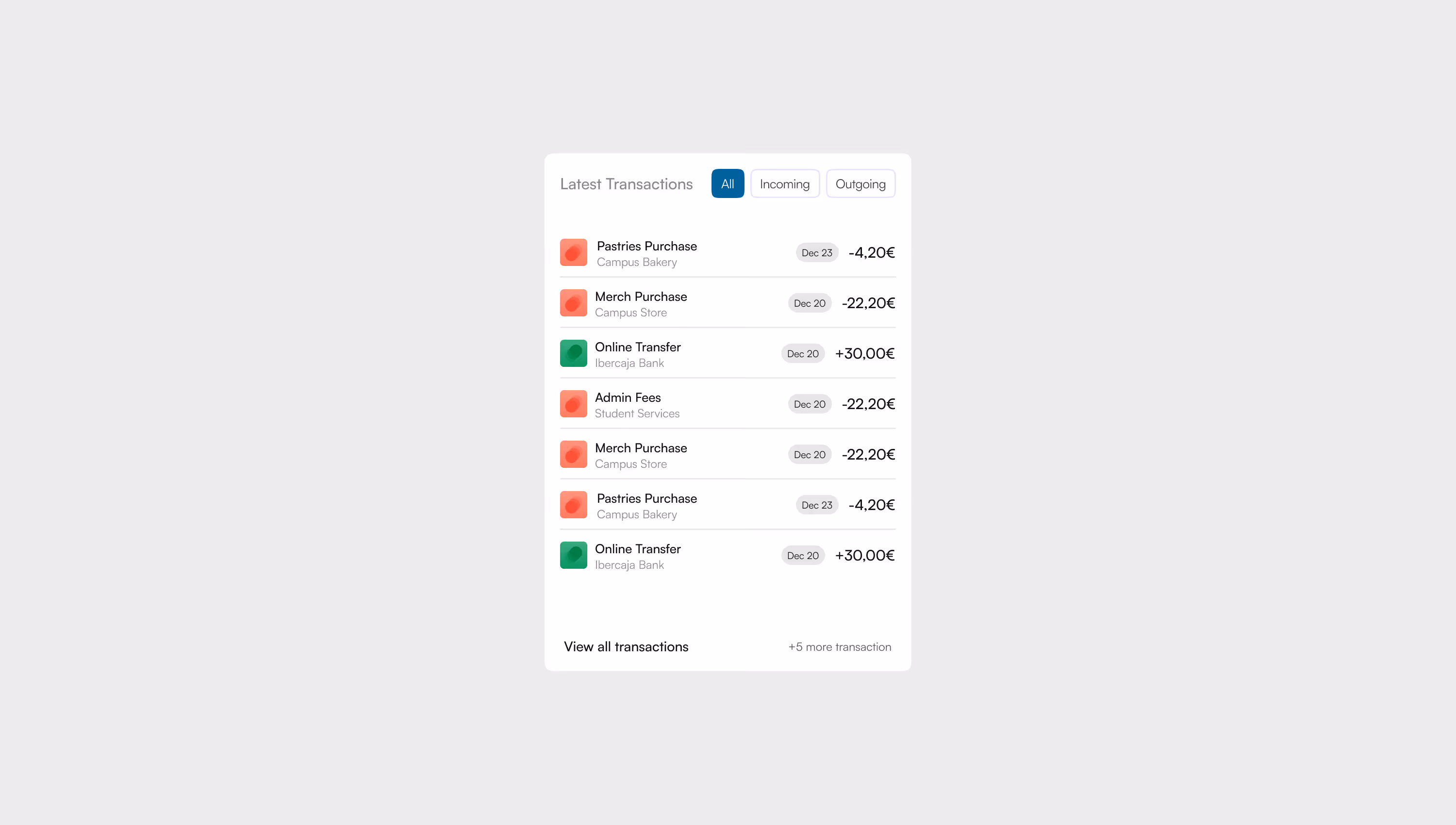
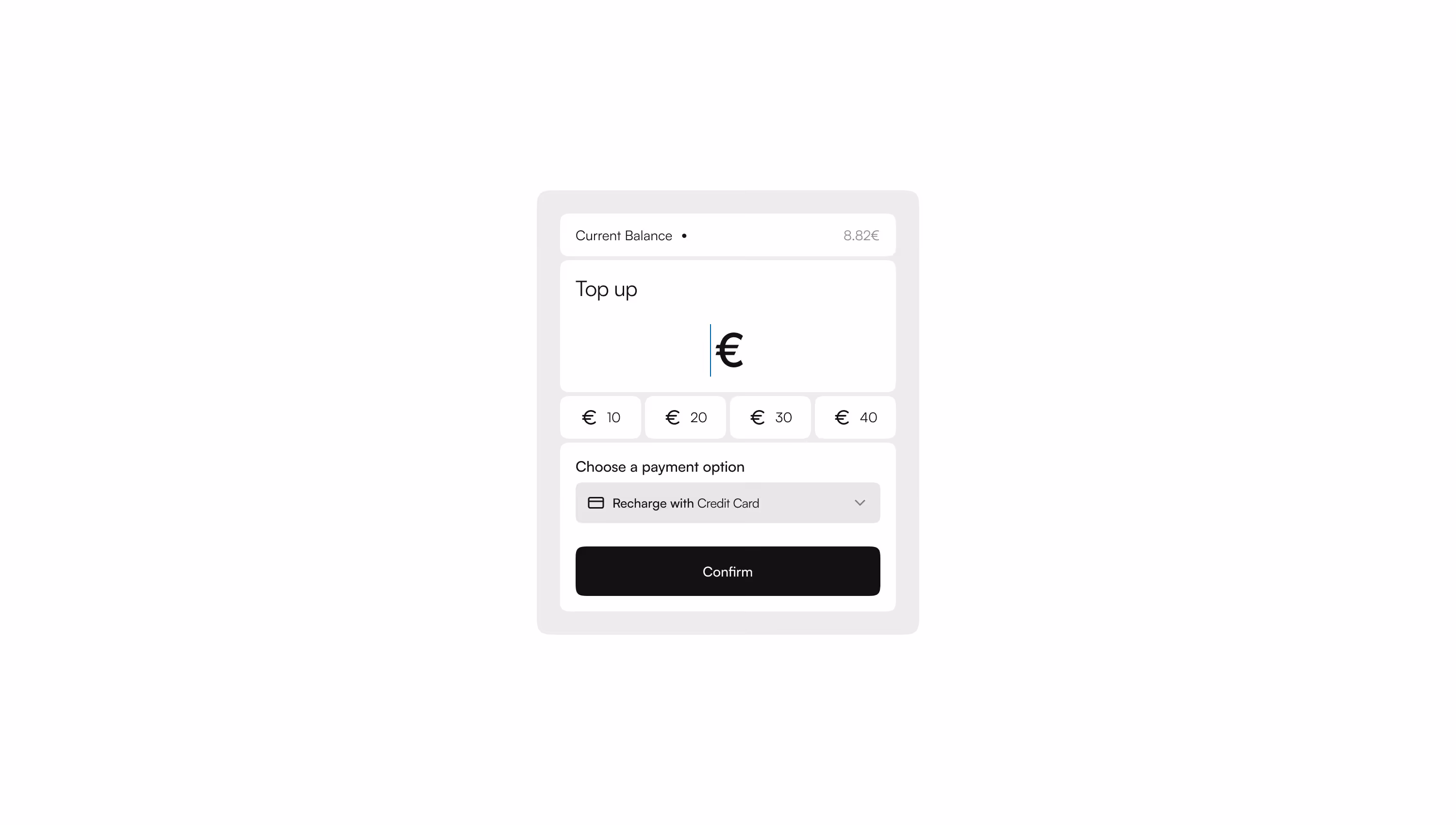
Designing a simpler way to pay on campus

izly.fr

Izly is a high-impact financial application used daily across France. Because of its scale and frequency of use, the product carries strong expectations around clarity, reliability, and accessibility. Over time, incremental updates had weakened the experience, creating inconsistencies and friction in core financial actions.

The objective of this project was to address those structural issues while maintaining user trust and operational stability.

Where the experience was breaking

The product had evolved through incremental updates, which led to structural and interaction issues that accumulated over time.

Key problems included:
  • Fragmented user flows for core financial actions
  • Inconsistent UI patterns across web and app
  • Accessibility gaps that created risk in a regulated context
  • Design decisions driven by legacy constraints rather than user needs
These issues increased cognitive load, reduced efficiency, and weakened trust in everyday financial interactions.

Understanding the system before changing it

Before redesigning anything, I focused on understanding the system as it existed. I conducted a full analysis of the app experience, mapping user flows, reviewing the information architecture, and identifying friction points in high-frequency tasks. Accessibility and technical constraints were assessed early to avoid late compromises. This work led to a clearer site structure and a shared understanding of which journeys actually mattered.

The Process behind

Research: Looked at how people actually experience accessibility. Not just what the guidelines say, but where they break down in real life. Focused on the gaps, the frustrations, and the barriers that stop people from using what gets built.

Planning: Stripped everything down to the core. No bloated structure, no endless theory. Just a straight path from problem to solution.

Content Creation: Clear, sharp, human. Cut the noise, ditched the filler. Every word had to earn its place or it was gone.

Design: Built for action, not decoration. Layouts that guide, not distract. Interfaces that get out of the way so the message comes through.

Testing: Asked the hard questions. Does this actually help someone build better right now, or is it just noise? If it was noise, it got cut.

Iteration: Nothing is final. This handbook is alive, built to grow with new insights, stories, and lessons.

Writing the content

The writing process was guided by three rules.
  • Be straightforward and use clear, simple language that makes ideas easy to understand.
  • Respect the reader’s intelligence by assuming they can grasp complex concepts without unnecessary explanation.
  • Give readers clear steps they can follow by providing actionable guidance so they know exactly what to do next.

Designing the experience

I designed the site to feel approachable without being sentimental. Every layout choice supports clarity.
  • Simple hierarchy
  • Straightforward cards
  • Short paths through the content
  • No empty decoration
  • No tricks to make the writing feel more important than it is

Current State

The Handbook is a practical tool teams can use at their own pace. Even now, it helps clarify responsibilities, resolve common issues earlier, and improve communication. The Handbook is a practical tool people can use at their own pace.

A pocket version is available for quick guidance while the full Handbook is being developed.

Everyone has a unique story to tell, regardless of ability or disability.