An App to help you understand Digital Accessibility better.

The handbook explains what matters and why it matters in a way that is clear and actionable. Readers can quickly identify barriers, understand their impact, and fix them early, without fluff, guilt, or theatrics.

Rethink was created to address accessibility in an approachable way; emphasising web accessibility with the help of a story.

The Challenge

Inaccessible websites can prevent people with disabilities from accessing critical information and services. These barries affect individuals with a wide range of disabilities, including auditory, cognitive, neurological, physical, speech, and visual impairments. Despite the importance of web accessibility, many designers lack awareness and understanding of how to create inclusive digital experiences.

How to fix it?

Empowering inclusive design through immersive Storytelling. Rethink is an innovative, story-based app that guides users through web accessibility principles and best practices. It’s intuitive, mobile-focused design empowers both designers and non-designers to create inclusive digital content.

The Impact

Increased awareness: By immersing users in stories that highlight the challenges faced by people with disabilities, Rethink greatly increased awareness of web accessibility issues among designers and the general public.

Empowering designers with tools: With its library of accessible tool to ease the use of adding accessibility into interfaces it was really easy for them to implement it on projects.

The impact of Rethink would extend far beyond the app itself, it has the potential to create a ripple effect of increased awareness, empathy, and action towards building a more inclusive digital world if pursued further.

To understand perceptions and knowledge of digital accessibility, we created a questionnaire. This will help develop user personas and gather insights to build a user-friendly, inclusive digital experience.

The questions focused on their current knowledge and what would make them want to learn more about the topic.

Understanding the issue at hand

I wanted to do further research through a interview with people having some type of disability, to determine if I was addressing a valid concern.
I sampled their various thoughts, difficulties they face and what could be improved.

Key findings

All interviewees admitted to already have heard about it to some extent but never really looked into it, because it  was something they never had to work with.
  • Adding real world examples from people with disabilities would help people see the problems first hand
  • Lack of finding good and bad examples for digital accessibility
  • Visual representation missing sometimes

From this I concluded

The lack of knowledge is standing in the way of making better accessible interfaces, and also a way on how to get their attention.
This begged the questions:
  • In what way should I share good accessible practices with others?
  • Including a story or interactive elements would make them dive deeper into the issue?
These personas were carefully crafted to accurately depict the characteristics and behaviors of specific target groups.

Designing a simple and manageable experience. I designed the main flow with first-time users in mind, introducing them to the key features while having it feel simple and manageable.

Adhering closely to a set of product constraints helped me set a focused approach:

Accessible colour palette

Accessible colour palettes typically use high contrast colours and avoid using colour combinations that are difficult for people with certain types of colour vision deficiencies to distinguish. The WCAG recommends a contrast ratio of at least 4.5:1for normal text and 3:1 for large text. The ratio of 4.5:1 or more is what I wanted to achieve,

Creating a playful brand

The brand identity centers around the Rethink concept, using a bold, accessible color palette and modern typography. The design is crafted to ensure inclusivity, reflecting the brand's commitment to fresh perspectives and creative solutions that are accessible to all.

Illustrations

The illustrations below showcase a diverse collection of characters and symbols designed to visually represent different expressions, emotions, and sensory elements, adding a playful and engaging element to the overall design.

Wireframes

Taking in consideration the previous stages of the Site Map and User Flow, initial sketches were drawn manually. The next step in the exploration of the interfaces involved transitioning to a digital platform, specifically utilizing the software Figma. This allowed for the precise definition of how the remaining interfaces would be rendered digitally.

Keep it consistent with a Design System

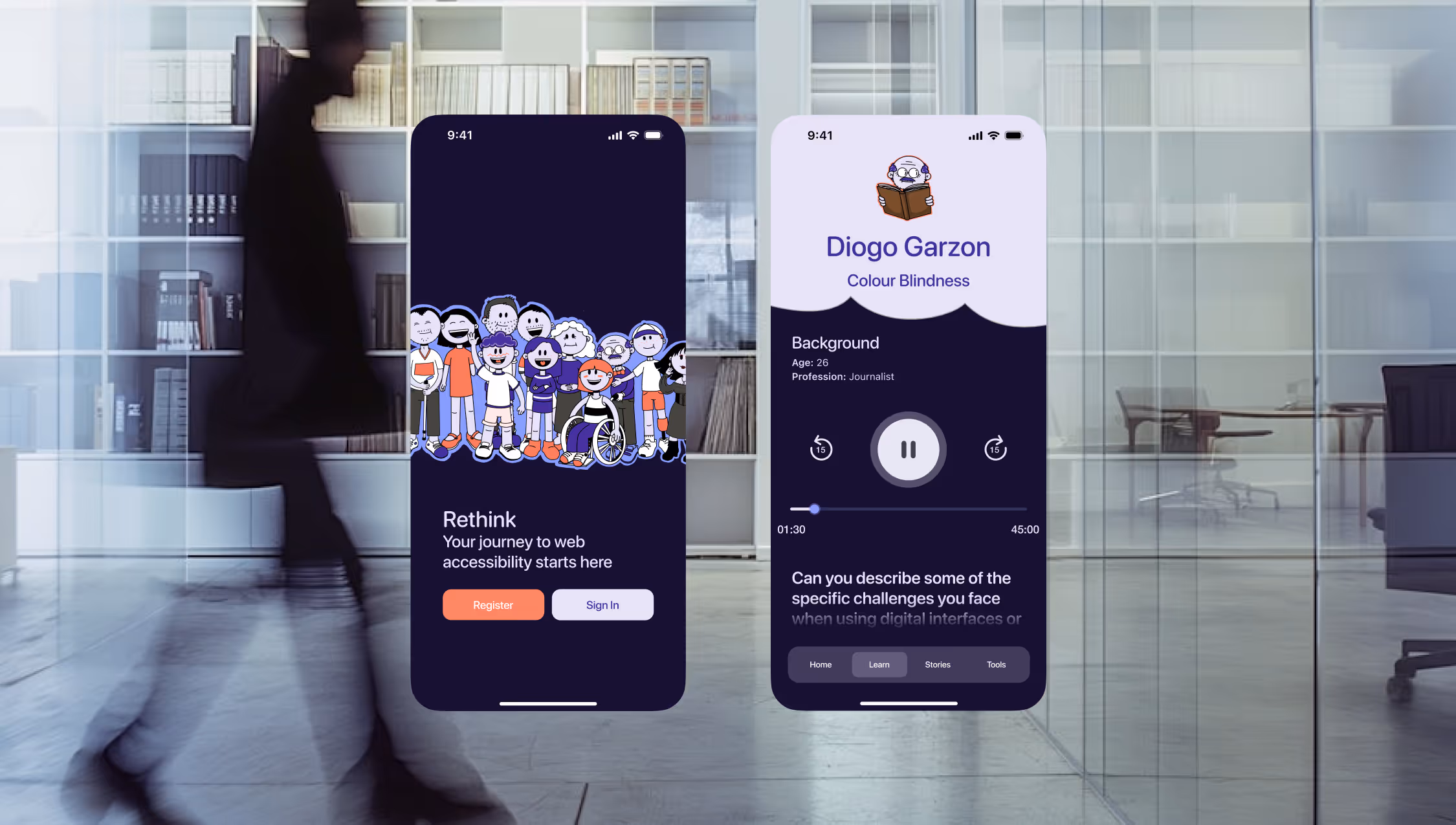
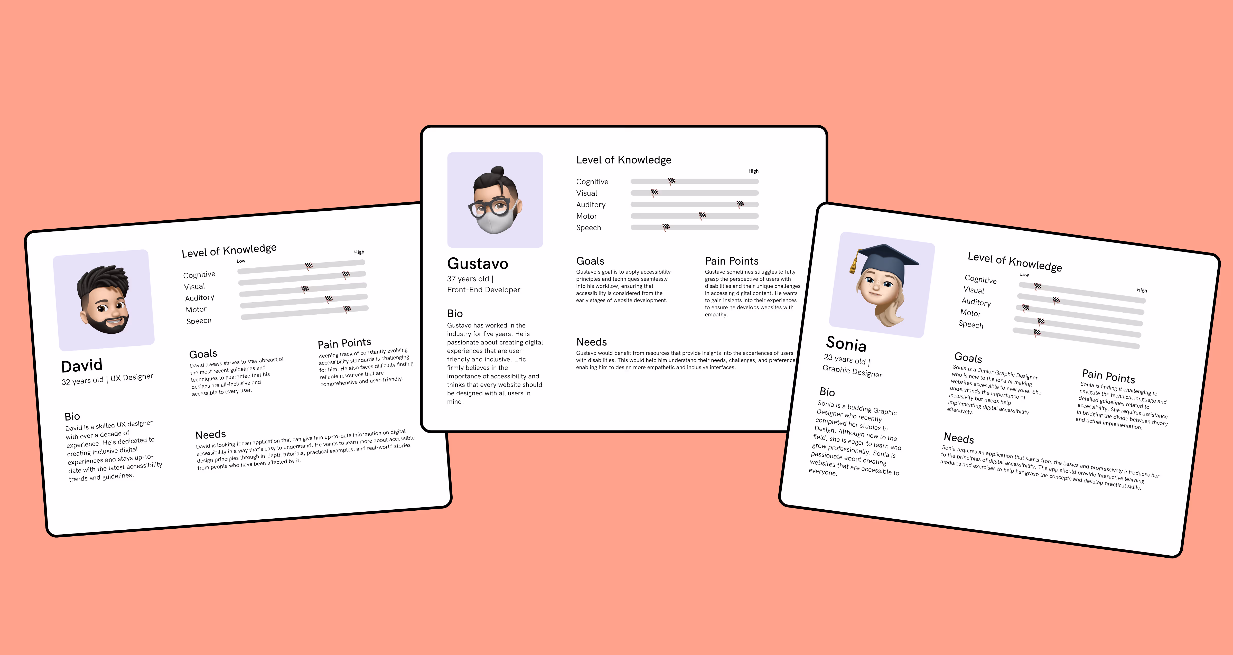
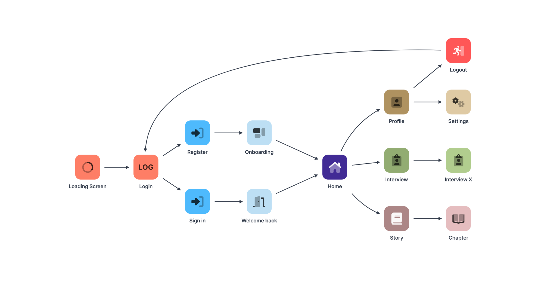
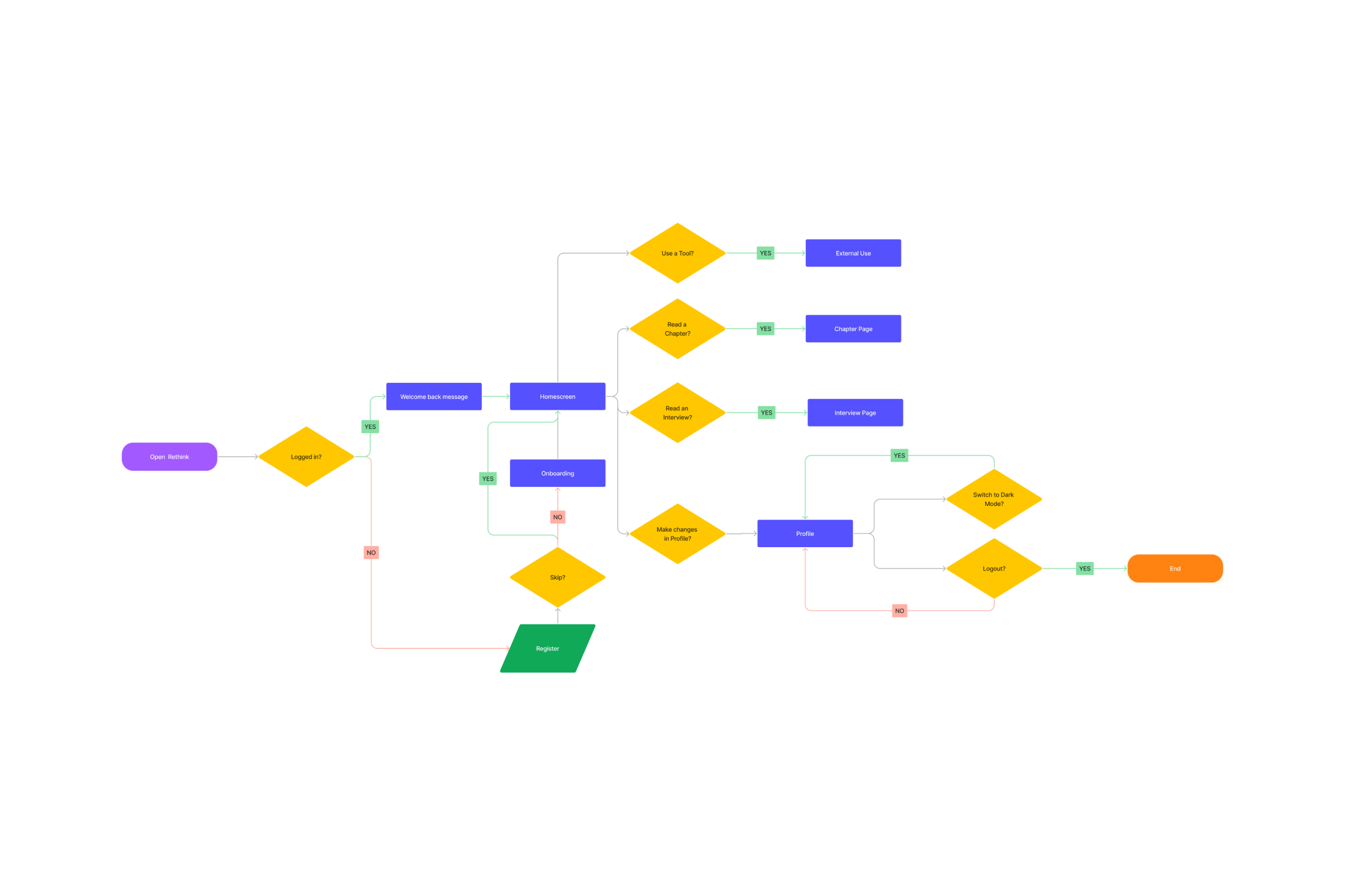
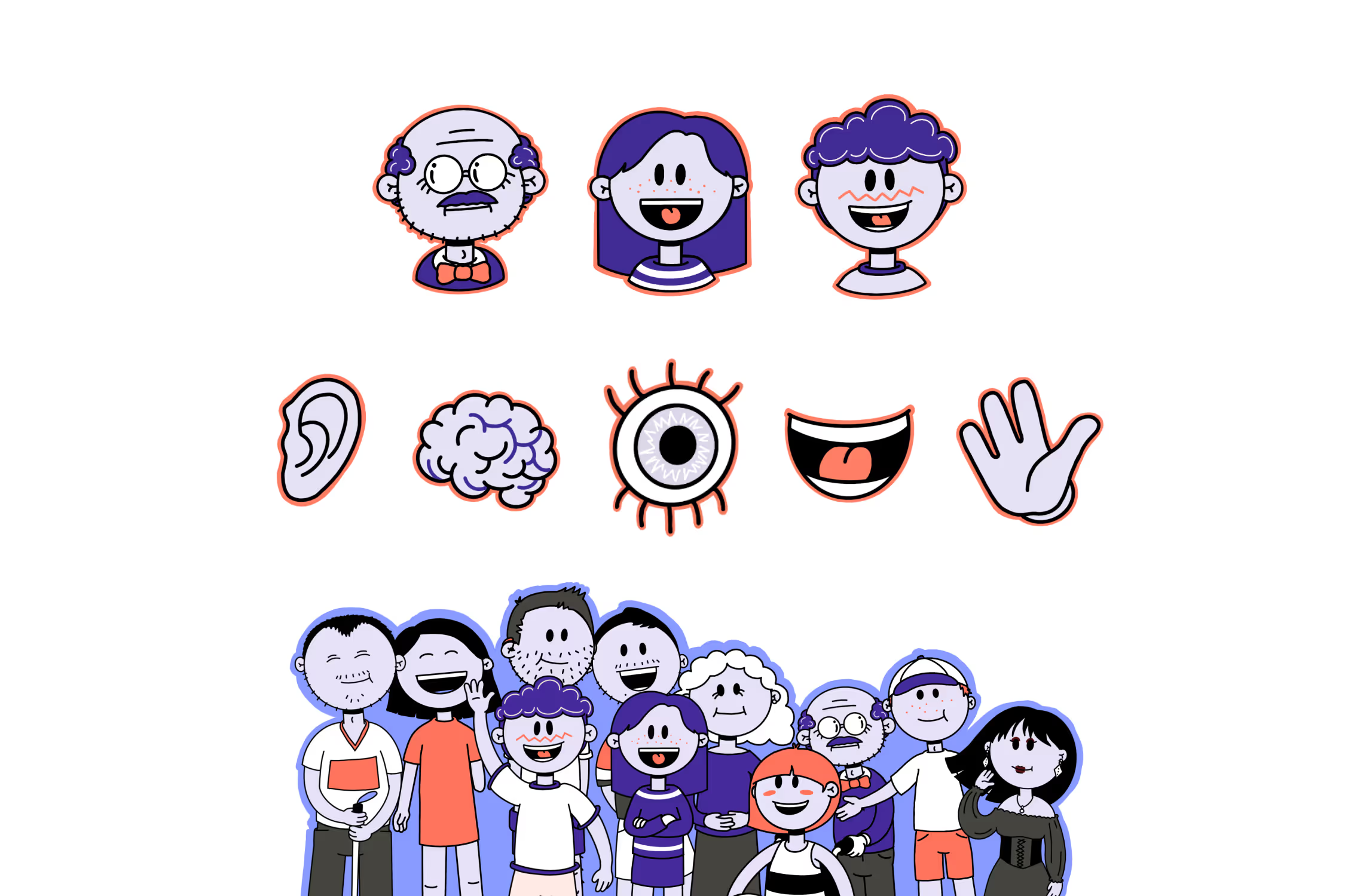
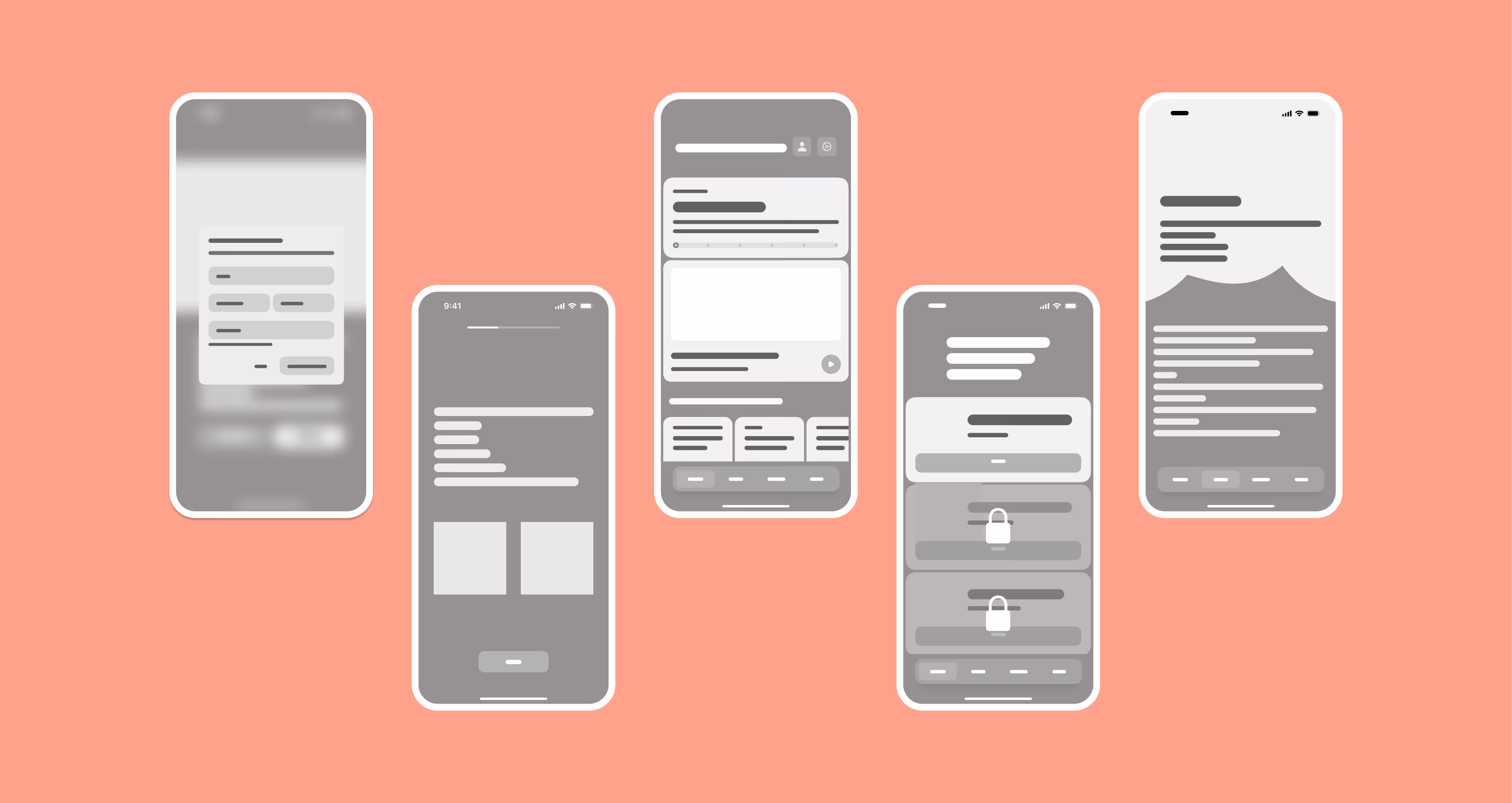
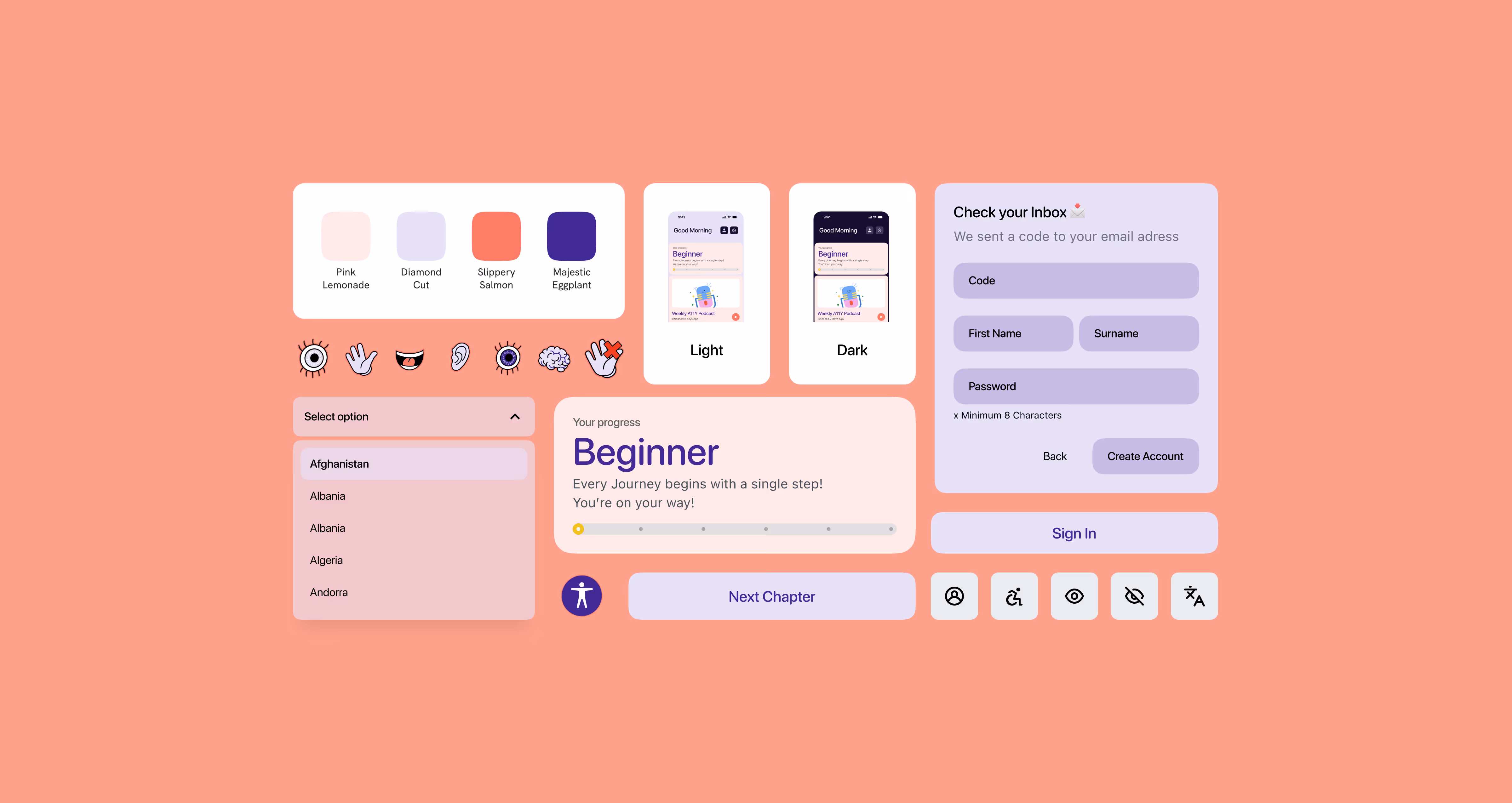
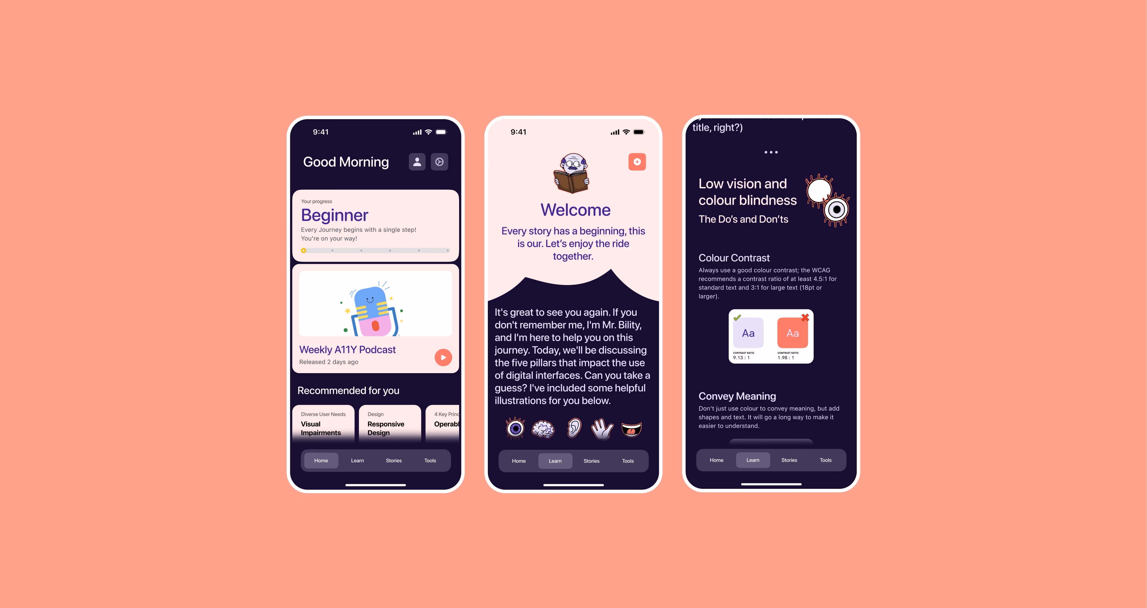
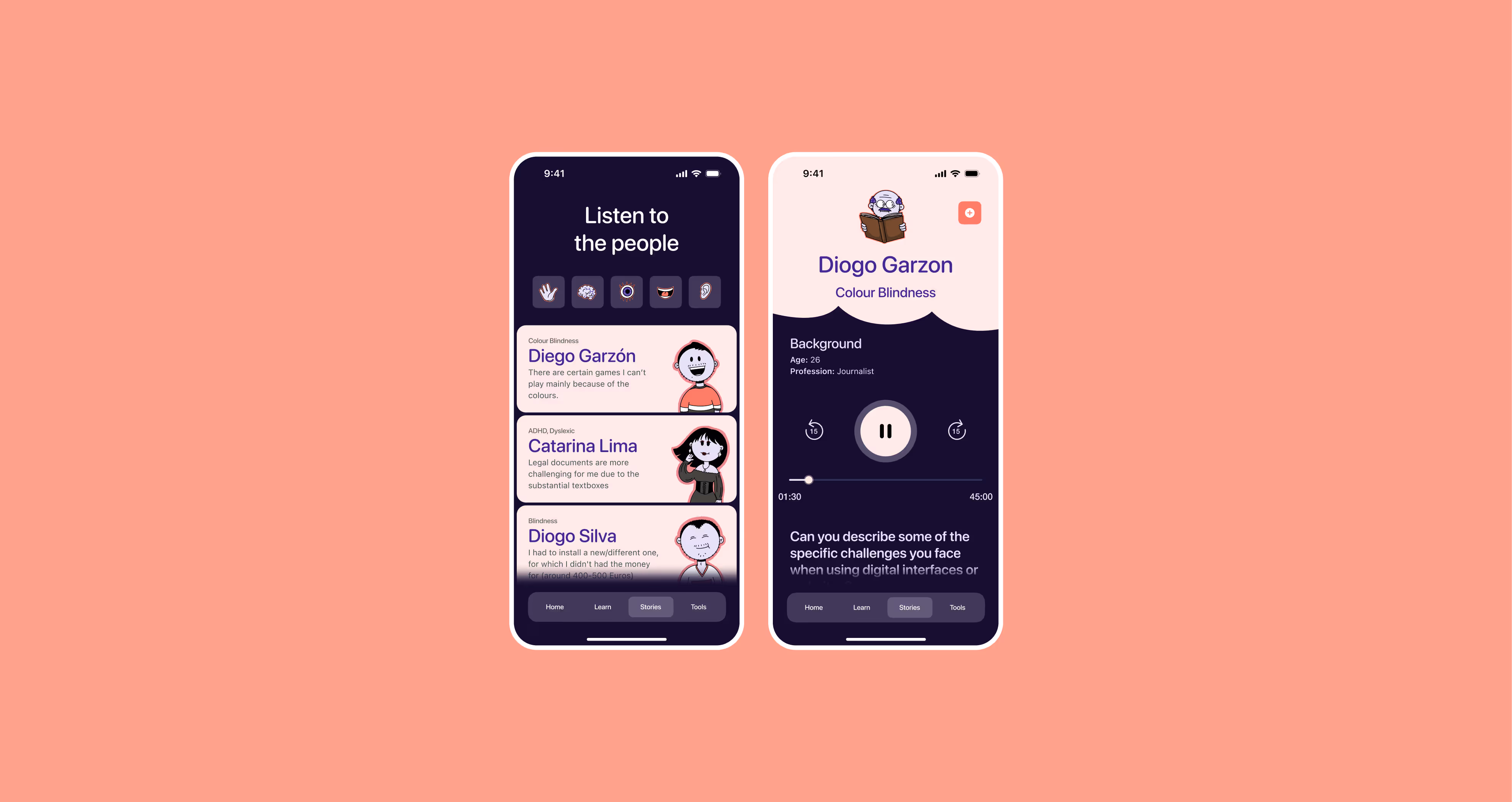
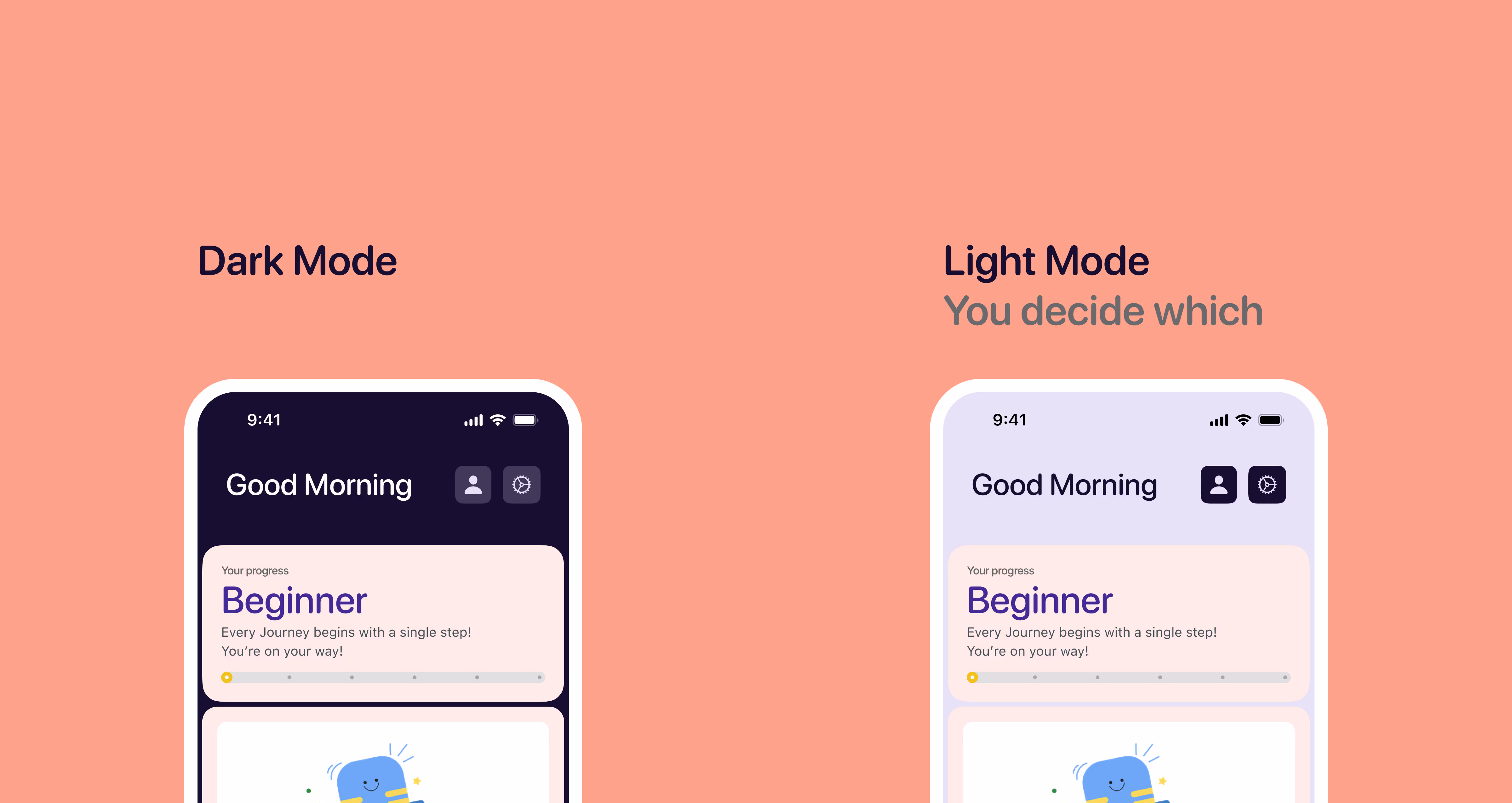
An initial Design System was developed to assist in organizing UI elements such as the layout, typography, colors, iconography, logo, cards, buttons, and illustrations. Elements such as buttons and cards will be shown in their default, pressed, and checked state.

Upon completion of the previous stages, including Information Architecture, Site Map, User Flow, Wireframes, and Wireflows, the final Prototype was developed. During this phase, the interface was populated with elements from the established Design System.

The High-Fidelity Prototype has been utilized for the purposes of conducting usability testing.

The End? Not really. The long process of researching, testing, and repeatedly honing my designs has led to a project I’m proud of, but still, I believe there’s a lot of room for improvement.

What I learned

Taking in consideration the previous stages of the Site Map and User Flow, initial sketches were drawn manually. The next step in the exploration of the interfaces involved transitioning to a digital platform, specifically utilizing the software Figma. This allowed for the precise definition of how the remaining interfaces would be rendered digitally.
  • It's good to ask for lots of help! Having a fresh pair of eyes helped get a different view of things
  • Settling on a good word choice can be harder than settling on a design choice..
  • Brand identity is formed through every decision in tone, color, shapes, and more!

Something I want to improve

I'd like to work more on my research method. The sample for my initial interview research was quite small and biased given that they were people I know. While they gave me incredible insights, it definitely would have been better if I reached out to a larger audience for more diversity!